How to Choose the Right Background for a PowerPoint That Actually Works
Picking a background for a PowerPoint isn’t just about colors and shapes—it’s about making sure your audience stays focused on your message, not your slides. A well-chosen background reduces eye strain, keeps text readable, and reinforces your brand without stealing the spotlight. Whether you’re presenting sales numbers, a project update, or a classroom lesson, the wrong background can turn a clear message into visual noise. The key is balance: contrast that works in a bright conference room, subtlety that doesn’t compete with your content, and consistency that ties your slides together.
Why Your Background Matters More Than You Think
A background isn’t decoration—it’s a tool. In a room with harsh fluorescent lighting, a dark background with light text can feel like staring into a spotlight. In a dimly lit auditorium, a bright background may wash out your words entirely. The best backgrounds adapt to the environment, not the other way around. Think of it as a stage: if the backdrop is too busy, your audience’s attention splits between your slides and the visual clutter. A clean, purposeful background keeps their focus where it belongs—on your ideas.
Match the Background to Your Message, Not Just Your Taste
Not all backgrounds work for every topic. A playful, colorful design might suit a creative pitch, but it can undermine a serious financial report. Ask yourself: What emotion or tone do I want to evoke? A minimalist gradient with soft shadows suggests professionalism, while a subtle geometric pattern adds energy without distraction. If your content is data-heavy, avoid backgrounds with heavy textures that make numbers harder to read. For storytelling slides, a thematic background (like a faint cityscape for a travel pitch) can reinforce your narrative without overpowering it.
Contrast Is King—Here’s How to Get It Right
No matter how sleek your background looks on your screen, it won’t matter if your audience can’t read the text in the back row. Follow this simple rule: text and key elements should always stand out against the background. White or light text works best on dark backgrounds, while dark text is clearer on light ones. Avoid mid-tone colors (like pastel blues or grays) for backgrounds—they create a “floating” effect where text seems to hover ambiguously. If you love a mid-tone color, use it sparingly as an accent, not the main backdrop. Test your slides in grayscale to ensure contrast isn’t lost when colors fade.

Keep It Simple: The 80/20 Rule for Backgrounds
Your background should do 20% of the work—letting your content shine—while taking up 80% of the space. That means:
- Stick to one background style per presentation. Mixing patterns or colors confuses the eye.
- Use transparency or blur effects on images to prevent them from competing with text.
- Limit background elements to one focal point (like a faint logo or a single texture).
- Avoid animations or transitions in the background—movement distracts from your delivery.
If you’re unsure, start with a solid color or a subtle gradient. These options are universally adaptable and rarely clash with content.
Tools and Templates to Skip the Guesswork
You don’t need design expertise to get this right. Free tools like Canva, Google Slides, and PowerPoint’s built-in templates offer pre-made backgrounds that follow contrast and simplicity rules. Look for templates labeled “professional,” “minimal,” or “modern” in their libraries. For custom designs, use tools like Adobe Color to test contrast ratios before committing. Remember: a template’s appeal fades if it forces you to squeeze your content into awkward spaces. Choose one that lets your text breathe.
Quick Fixes for Problem Slides
Already built a slide deck but the backgrounds feel off? Try these fixes:
- Desaturate the background: Reduce the color intensity in your image editing tool to make text pop.
- Add a semi-transparent overlay: Place a dark or light rectangle over the background to improve contrast.
- Crop aggressively: Zoom in on the most important part of your background image to remove distractions.
- Use a border: Add a thin, contrasting frame around your slide content to create a visual boundary.
These tweaks take minutes but can transform a cluttered slide into a clear, engaging one.
Final Check: Does Your Background Pass the Squint Test?
Here’s a quick way to spot problems: squint at your slide. If the background and text blend together, your contrast is too low. If the background feels overwhelming, it’s too busy. The best backgrounds fade into the background—literally. They support your content without demanding attention. Before you finalize your deck, ask a colleague to glance at your slides from across the room. If they can still read your key points, you’ve nailed it.
Surface Area Of Cylinder: Formulas, Key Differences On TSA & CSA
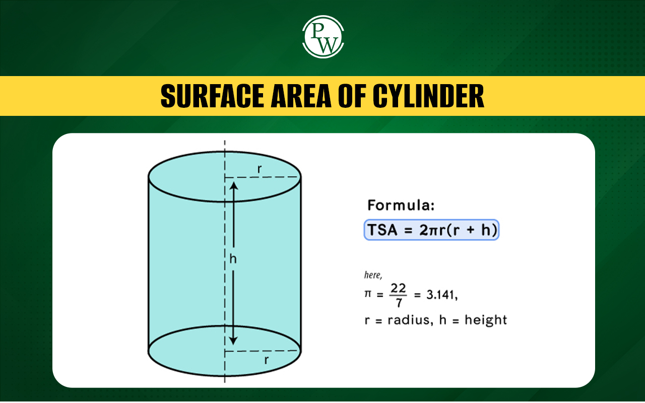
Surface Area of Cylinder: Formulas, Key Differences on TSA & CSA